June 8, 2005
FishEye
To be honest (yes, let's be honest, Dennis), I don't know why the title "FishEye" popped in my head. I should map the implications:
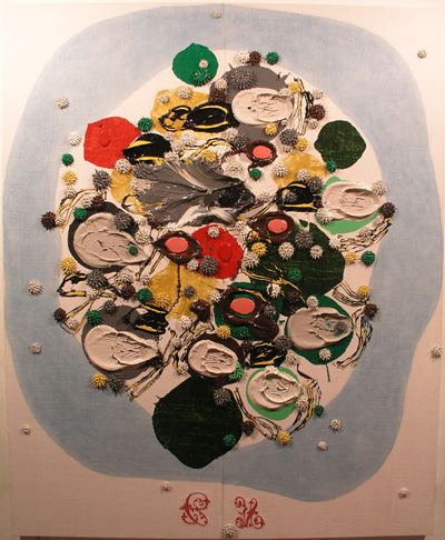
...that the circular fullness suggests the effect of the distortions that fill the visual field in the way that a fish eye image does. And it reinforces an idea of representation as the generative compositional engine of painting... although the reality of the making of this painting is the reverse of this. But even if that was the way that I had fashioned it (to render an image of a fish eyed world), there's something to the thought of a whole visual field gathered up in a ball, force fitting one schema (a wrap around visual field) into another (the fish eyed ball).
Such a title would provoke a representational interpretation, encouraging a blindness towards the physical dynamics of the painting-as-paint.... and even so, my approach to painting is so physical that there is still no hazard in glossing over the scrum of painterly marks as we make our way towards the imagined image.
It is this blue surround that is the provocateur. Looking back at the previous work, it is as if a mysterious blue gas was emitted from some kind of chemical reaction.
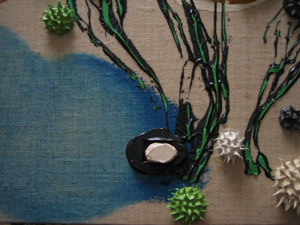
Here, one might see the history of its making: cerulean blue pressed on and then rubbed off.
The consequence of welcoming this new element in the mix is choosing how to deploy it. I tend to worry about how I begin a painting (an understatement). I think that the method of entry determines how you arrive at the final result. Maybe this is because of an economy of means, or a quality of elegance or concision that I look for along the way (real or imagined). Failure is a muddle and yet in all of my work process, there is a constant oscillation between the certitude of the executed plan and the bust-out-freaky-wild move that reveals something completely unexpected.
Add to this, the inevitabilty of an eschelon of mark making (those words, "mark" and "mark making"... I'm not so comfortable with them)... by this, I mean that each way I put paint down ("marks") has specific properties that are either enhanced or muted by the subsequent... mark (just go with it, Dennis). Cutting to the chase: imagine trying to lay down a misty blue Casper-like mark after a long train, a scrum of my other moves. It wouldn't be so misty, would it?
Therefore, there is a linkage and order of possibilities that assemble in train out of all the ways I apply the paint. Each painting requires on average, a week of working time. In each cycle, there is a long intial period of contemplation (that's putting it lightly), then a torrent of actions, then a slowing down to a coasting stop as I steer carefully to a finished painting. Usually, the last segment is all about careful edits that are meant to heighten what gains I had made in the torrent.
The initial phase can twist my stomach into knots. I tend to fret (another understatement which I hope to enlarge in a future blogpost) about the method of entry into the work, being concerned as I am in directing some how, in some way, in any way... the consequences.
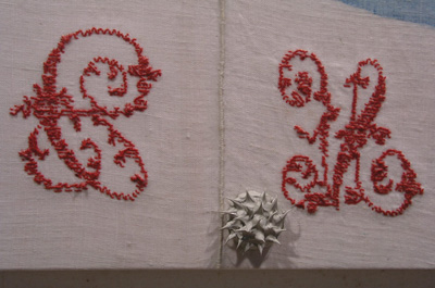
Now, what about this feature, you might ask? I have been using antique linens (the designation antique is a a customs term for goods over a hundred years old). My mother's business involves buying and selling various antique fabrics in Europe and selling them in the states. Over the years, she has shown me these domestic linens from Catalunya (Spain and France) and since I had been working with art store Belgian linen for several years, I was intersted in busting up the pattern (of the dark brown ground), perhaps going back to cotton duck. I like the linen weave, the light warm color, the evidence of human hands in the weave. The monograms are for me, touching. Humans were here.
Choosing to stretch the panels in such a way as to expose the monograms is a natural. My work coming out of grad school involved a sandwich strategy of mating an underpainting (which was extremely variable, abstract or representational, following whim and curiosity) and an over painting of what began as letter forms struck over the top, finishing the work. I came to see it as a Ruscha strategy in reverse. Over time, I moved away from an opposition (repulsion perhaps of image and text?) between under and over painting, towards affinity.. a merger.
All of my older records are in Los Angeles, and this is the only image I could find here in Spain. I'll blog more about the earlier stuff when I return to SoCal this Fall.
Posted by Dennis at June 8, 2005 4:41 PM
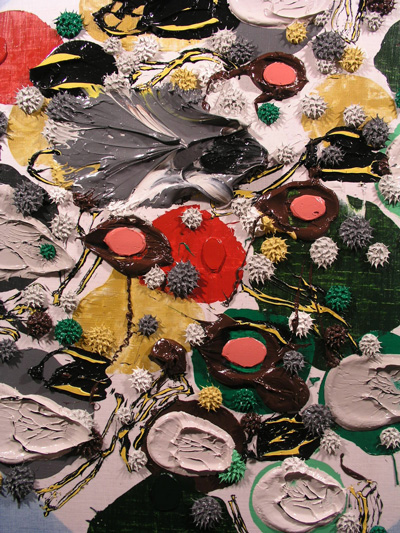
big platter with raw oysters on the half shell, melted chocolate covered cherries, spilled condiments. The red stitchery hints at the 'signatures' on Sumi paintings. Did the Japanese ever paint food?
Bill:
I can't think of any Japanese food imagery, but they do a great job simulating tempura in plastic!
A tip of the hat to you,
-D