January 10, 2017
Dos Declaraciónes / Two Statements
I was asked by my gallery in Barcelona, Spain (Galerie Miguel Marcos) to write a statement regarding the exhibition of a selection from the paintings I made in last summer in my studio in Tossa de Mar. What follows in a translation in Castellano and under the fold, the English version. I wrote two types, one large and wordy, and another shorter one.
Mi galería de Barcelona (Galerie Miguel Marcos) me pidió que escribiera una declaración sobre la exposición de una selección de las cuadros que hice el verano pasado en mi estudio de Tossa de Mar. Lo que sigue en una traducción en castellano y bajo el pliegue, un versión en Inglés. Escribí dos tipos, una grande y vertiginosa, y otra más corta.
***
La versión larga de una declaración:
Para contar la historia de las cuadros que se mostrarán en ARCO Madrid 2017, tendré que preámbulo con el cuento de dos prehistories. El relato que haré aquí sólo puede ser una parte de la narración más grande de cómo cada pintura lleva a pinturas posteriores, la última reciente y la otra un poco más remota.
Enmascaramiento y la implantación de la imagen por adelantado
Hace un par de años, había dado vuelta a las tablas en el camino que había abordado la pintura. En ese momento, estaba usando cinta adhesiva para reservar partes del lienzo sin pintar. Pronto, comencé a dar forma a la cinta más allá de la naturaleza lineal del material. En lugar de comenzar con un lienzo en blanco y llegar a una imagen, comencé con una imagen intrínseca a la forma de la máscara. Posteriormente, las formas se articularon con el tiempo.
La pintura opera entre los polos de dibujo y de agrupación. La agrupación es la forma viva de la pintura líquida. El primero hace distinciones, este último tiende a borrarlas. Me deleitaba en la secuencia de inscribir una imagen con la creación de la máscara, perdiendo el diseño en un caos de pintura, recuperando la imagen con la eliminación de la máscara, maravillándome con el realce del diseño inscrito, y finalmente "ensuciando" o añadiendo un toque de caos al deslizar el raspado del exceso de pintura hacia atrás sobre la pintura desenmascarada que parecería demasiado "limpia" de lo contrario.
Historia de origen de la plantilla de carta
Pasando de la cuadro a la cuadro, la máscara articulada alcanzó un apogeo con una serie de cuadros que explotan la forma orgánica de hojas caídas y viñas colgantes. En 2015, me había alejado de la verosimilitud y se centró en los diseños geométricos repetitivos que por el verano se había manifestado como formas de asterisco. Persiguiendo este motivo a tierra por la primavera de 2016, quería encontrar otro motivo, que no era tan rigurosamente regular como la geometría, pero todavía figura tan fuerte como los asteriscos.
Tenía ensamblajes de formas de cartón carta que había utilizado para hacer pinturas de 2008 colgando en las paredes de mi taller. Los utilicé como herramientas para estampar pintura en el lienzo. Eran simples cartón rígido con pestañas para manejarlas mientras yo plantaba sus superficies cubiertas de pintura sobre el lienzo, cubierto de impasto. Pero después de su uso no estaba dispuesto a tirarlos. Más tarde, cuando se secaron, hice esculturas de ellos y los mantuve a la vista.
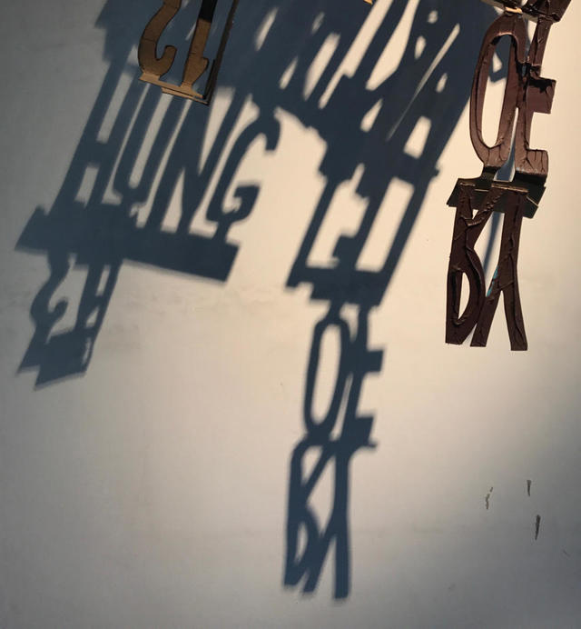
Lo que había ocurrido era el momento de la epifanía creativa clásica, cuando buscaba la alternativa a los asteriscos, que había notado que las sombras de los sellos de las letras poseían las cualidades que buscaba. Coloqué un lienzo bajo las sombras y trace el contorno. Yo estaba fuera a las carreras. Me di cuenta con deleite que las formas de la carta tenían una integridad plástica tal que podía inventarlas a voluntad. Me podía mover libre de las sombras en la pared. Utilizo el texto para fines visuales, y así me siento libre de romper la secuencia de caracteres, de invertirlos, de invertirlos como la pintura lo requiere.
Lorenzo
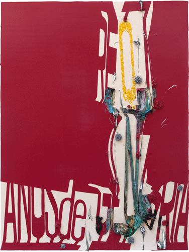
Pasando mis veranos en España como lo he hecho durante tantos años, pintando en mi taller, mi mente se revuelve con pensamientos visuales y linguales. Aprender Castellano a una edad tan avanzada tiene sus costos y, sin embargo, cada año me solicito y vuelvo a aplicarme. En las últimas horas de la madrugada, algunas palabras y frases vienen a la mente y las doblo y las encajo en mis intenciones pictóricas. Con el cuadro llamada Lorenzo, llamé la imagen del sol de verano. El nombre es también el de un hombre, y como el sol persistente de la Costa Brava, este Lorenzo tiene para mí un carácter insistente, implacable y barbudo de rayos. El sol es la totalidad del mundo, somos sólo la concrescencia de los elementos arrancados por los vientos solares.
Años de Gloria
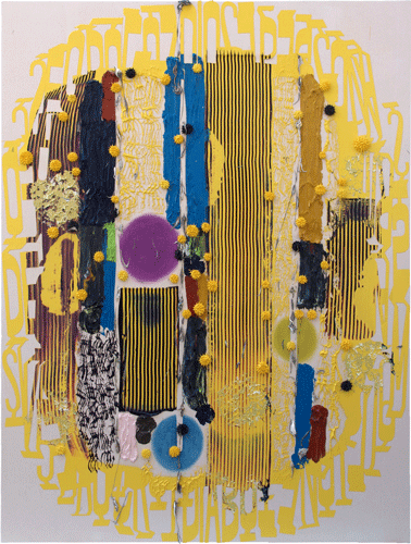
Tiendo a encogerse de hombros en una lectura literal del texto que exploto en estas cuadros. Utilizo la tipografía para propósitos pictórico-pictóricos con la astuta apreciación de que los antiguos precedentes para ellos eran pictográficos. Me gusta la ironía de los pictogramas rendidos transparentes a una vista más allá. Cuando se me pide que descodifique los aspectos textuales de las cuadros, me entrego con una respuesta, confiando en que no habrá ningún obstáculo para la pintura-cua- pintura. Las palabras, los nombres y las frases surgen en mi mente mientras pinto y las uso para fines de pinturas, para conducir la abstracción. En este caso, los años de gloria fueron golpeados por Lorenzo, que baja como el sol de lo alto. Si usted me pregunta por qué, debo confesar que la fuente de esta inspiración me fue indicada por mi intuición, y todavía esta es una caja negra que no se puede abrir a partir de este momento.
quinto piño
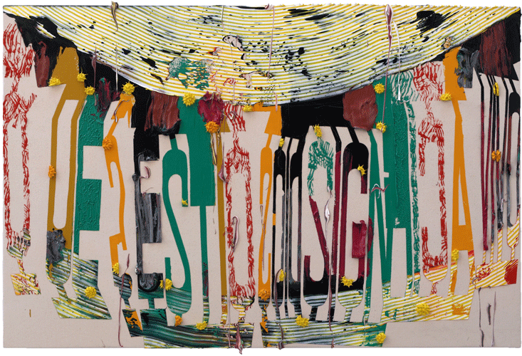
Los títulos de todas mis cuadros están hipervínculos a las páginas de mi weblog, que se utiliza como un semillero para ser dowsed para la nominación significativa. Si navegas por la web hasta el 4 de septiembre de 2016, encontrarás una página de mi cuaderno de bocetos "Language Lessons", un diccionario hecho a mano de Castellano, Catalán e Inglés, encontrarme en la parte posterior del más allá es resonante para mí porque crecí todo Sobre el mundo y por lo tanto el quinto piño tiene el anillo de la casa para mí.Puede consultar mi diccionario, se puede ver las palabras "¿Que significa estar vivo?", que para mí resuena con el lugar mencionado, el quinto piña, Desde Lorenzo en lo alto.
***
La versión corta de una declaración:
El marco es una precondición del arte, crea un subconjunto estético del mundo. Esta ventana es una oferta para consideración especial. La pintura fue liberada dos veces, primero de la arquitectura y después de la verosimilitud (gracias, fotografía). Librado de ambos, pintando asintiendo en señal de reconocimiento, al primero en rectilinearidad y al último al menos en apercepción. El marco inscrito dentro del marco del lienzo no tiene que conformarse al rectilíneo. Pero estar desvinculado tampoco es tener tracción, así que decidí por lo tanto concentrarse en los aspectos visuales del texto para qué fortuna esta fricción podría traer.
Los antepasados de todos los sistemas de escritura eran pictográficos, y me deleito en hacer el aspecto formal de las letras transparente a una vista más allá. La máscara revela obscureciendo, la imaginación puentea la abertura. Las formas de letra están codificadas con un conjunto finito de reglas para su morfología y las proporciones de las cuales pueden ser manipuladas plástico a través de sus proporciones. Al igual que el conjunto de reglas de la tipografía, la belleza de la pintura se deriva de sus limitaciones. Así es a través del conjunto finito que busco el infinito.
The long version of a statement:
To tell the story about the paintings that will be shown in ARCO Madrid 2017, I will have to preface with the tale of two prehistories. The account that I will here render can only be a portion of the larger narrative of how each painting leads to subsequent paintings, the latter recent and the other a little more remote.
Masking and the implantation of the image up front
A couple of years ago, I had turned the tables on the way I had approached painting. At the time, I was using tape to reserve portions of the canvas unpainted. Soon, I began to shape the tape beyond the linear nature of the material. Instead of starting with a blank canvas and arriving at an image, I began with an image intrinsic to the shape of the mask. Afterwards, the shapes became more articulated over time.
Painting operates between the poles of drawing and pooling. Pooling is the vivid form of liquid paint. The former makes distinctions, the latter tends to erase them. I delighted in the sequence of inscribing an image with the creation of the mask, losing the design in a chaos of paint, recovering the image with the removal of the mask, marveling at the enhancement of the inscribed design, and finally "dirtying up" or adding a touch of chaos by flicking the scraping of excess paint back onto the unmasked painting that would seem too "clean" otherwise.
Origin story of the letter template
Moving from painting to painting, the articulated mask reached an apogee with a series of paintings that exploited the organic form of fallen leaves and hanging vines. In 2015, I had pulled back from verisimilitude and focused on repetitive geometric designs which by the summer had manifested as asterisk forms. Chasing this motif to ground by the spring of 2016, I wanted to find another motif, one that wasn't as rigorously regular as geometry but still figured as strongly as the asterisks did.
I had assemblages of cardboard letter forms that I had used to make paintings from 2008 hanging on the walls of my studio. I used them as tools to stamp paint onto the canvas. They were simple rigid cardboard with tabs to handle them as I planted their paint covered surfaces onto the canvas, lathered with impasto. But after their use I wasn't willing to throw them away. Later as they dried, I made sculptures of them and kept them in sight.
What had occurred was the moment of classic creative epiphany, when I was searching for the alternative to the asterisks, that I had noticed the shadows of the letter stamps possessed the qualities I was looking for. I placed a canvas under the shadows and traced the outline. I was off to the races. I realized with delight that the letter forms had such a plastic integrity that I could invent them at will. I could move free of the shadows on the wall. I use the text for visual purposes, and so I feel free to break the character sequence, to reverse them, invert them as the painting requires.
Lorenzo
Spending my summers in Spain as I have for so many years, painting in my studio, my mind swirls with thoughts both visual and lingual. Learning Castellano at such a late age has its costs and yet every year I apply and reapply myself. In the late hours of the madrugada, certain words and phrases come to mind and I bend and fit them into my painterly intentions. With the painting named Lorenzo, I summoned the image of the summer sun. The name is also that of a man, and like the persistent sun of the Costa Brava, this Lorenzo has for me an insistent character, relentless and bearded with rays. The sun is the totality of the world, we are but the concrescence of the elements blown off by solar winds.
Años de Gloria
I tend to shrug at a literal reading of the text that I exploit in these paintings. I use typography for pictorial-painterly purposes with the sly appreciation that the ancient precedents for them were pictographic. I like the irony of pictograms rendered transparent to a vista beyond. When I am asked to decode the textual aspects of the paintings, I indulge with an answer, confident in that there will be no obstacle to the painting-qua-painting. Words, names and phrases arise in my mind as I paint and I use them for paintings' purpose, to drive abstraction. In this case, the glory years were knocked by Lorenzo, who comes down as the sun from on high. If you ask me why, I must confess that the source of this inspiration was indicated to me by my intuition, and as yet this is a black box that cannot be opened as of this moment.
quinto piño
The titles of all my paintings are hyperlinked to pages in my weblog, which is used as a seedbed to be dowsed for meaningful nomination. If you navigate the web to September 4, 2016, you will find a page from my sketchbook "Language Lessons", a handmade dictionary of Castellano, Catalan and English. Finding oneself in the back of beyond is resonant to me because I grew up all over the world and therefore el quinto piño has the ring of home for me. By consulting my dictionary, you can see the words ¿Que significa estar vivo?, which for me resonates with the aforementioned place, el quinto piña, all of which rains from Lorenzo on high.
***
The short version of a statement:
The frame is a precondition of art, it creates an aesthetic subset of the world. This window is an offering for special consideration. Painting was liberated twice, first from architecture and later from verisimilitude (thank you, photography). Freed from both, painting yet nods in acknowledgment, to the former in rectilinearity and to the latter at least in apperception. The frame inscribed within the frame of the canvas does not have to conform to the rectilinear. But to be unbound is also not to have traction, so I chose therefore to focus on the visual aspects of text for what fortune this friction might bring.
The ancestors of all writing systems were pictographic, and I take delight in making the formal aspect of letters transparent to a vista beyond. The mask reveals by obscuring, the imagination bridges the gap. Letterforms are encoded with a finite set of rules for their morphology and the proportions of which can be manipulated plasticly via their proportions. Like rule set of typography, the beauty of painting stems from its limitations. It is thus through the finite set that I seek the infinite.
Posted by Dennis at January 10, 2017 11:04 AM
Leave a comment