December 21, 2016
GS DH RV: 01/12/17
Left to right: Gary Stephan, Dennis Hollingsworth, Rafael Vega
This coming January 12th, 2017, I will be grouped in a show at Hionas Gallery in NYC's Lower East Side with Gary Stephan and Rafael Vega. Naturally, I'm delighted.
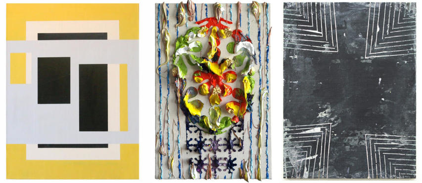
Gary is a legend in abstract painting. A graduate of the San Fransisco Art Institute, studying under Diebenkorn, he arrived in the Big Apple in 1968, was a studio assistant to Jasper Johns, sold out his first solo show to Philip Johnson, was included in the Whitney Biennial in 1972. And this is only the story of the beginning of his career. He's seen it all and steered by his own light while the tides of art world fashion swirled around him incessantly.
Rafael's first degree was in chemistry before he switched to art in his home island of Puerto Rico. He went to grad school in the School of the Art Institute in Chicago, graduating in 2012. He was included in the esteemed Phaidon survey book Vitamin P3 and he has been recently acclaimed by trusted art critics such as Barry Schwabsky.
I was able to visit both of their studios last week and with each I was immersed in conversations that were far too short even though they had lasted for hours. Rafael's place is in the badlands of Bushwick. His studio packed with paintings in progress, one room hung with experiments in large scale and another room hung with smaller finished paintings. His walls were his notepad and scratchpad, a rebel aesthetic that is also mirrored in his finished paintings. Gary has lived and worked in the same location at the extreme West end of Canal Street overlooking the Hudson River for 40 years, a plum studio that was surely the badlands of Manhattan in the 70's.
I'm happy to be bracketed by the alpha and omega of these two artists, generations apart. We are all painters of abstraction, and more. We are a specific species of painter that appreciates the continuity between abstraction and its' other, representation. One of us, apparently "pure" and one of us apparently "dirty", I think we all understand and relish the currents between perception, apperception and aporia.
There are two other articles that I had encountered online a few days after the studio visits that for me shown a light on both of these artists. The excerpts that I will feature below will require some introduction.
During my studio visit with Gary, he talked about how he subtly runs visual systems against each other. Pointing to a recent painting where he exploited a suggested foreground and background in a way that would cause -yet frustrate- a viewer to trace a visual cause and effect, I suggested that he was collaging chapter 3 with chapter 5 from Rudolf Arnheim's Art and Visual Perception. I was grateful that Gary laughed in agreement. Below this post, you will find links that might illustrate what I mean by these distinctions and their internal contradictions. One one of the links, an interview with Chicago's infamous Bad at Sports, Stephan described how his painting is inspired by Manet's Luncheon on the Grass. The disjunctive visual fields that had upset so many people a century ago required the viewer to make connections for themselves and not rely on an external authority to instruct meaning for them. This lesson is evergreen. There are yet too many scripts and external authorities in art nowadays.
I think this excerpt from This is your brain on art: a neuroscientists lessons on why abstract art makes our brains hurt so good tells the story quite well:
In abstract painting, elements are included not as visual reproductions of objects, but as references or clues to how we conceptualize objects. In describing the world they see, abstract artists not only dismantle many of the building blocks of bottom-up visual processing by eliminating perspective and holistic depiction, they also nullify some of the premises on which bottom-up processing is based. We scan an abstract painting for links between line segments, for recognizable contours and objects, but in the most fragmented works, such as those by Rothko, our efforts are thwarted.(Emphasis, mine.)Thus the reason abstract art poses such an enormous challenge to the beholder is that it teaches us to look at art -- and, in a sense, at the world -- in a new way. Abstract art dares our visual system to interpret an image that is fundamentally different from the kind of images our brain has evolved to reconstruct.
Kandel describes the difference between "bottom up" and "top down" thinking. This is basic stuff for neuroscience students, but brand new for art historians. Bottom up thinking includes mental processes that are ingrained over centuries: unconsciously making sense of phenomena, like guessing that a light source coming from above us is the sun (since for thousands of years that was the primary light source, and this information is programmed into our very being) or that someone larger must be standing closer to us than someone much smaller, who is therefore in the distance.
Top down thinking, on the other hand, is based on our personal experience and knowledge (not ingrained in us as humans with millennia of experiences that have programmed us). Top down thinking is needed to interpret formal, symbol or story-rich art. Abstraction taps bottom-up thinking, requiring little to no a priori knowledge.
[...]
But the mind-bending point that Kandel makes is that abstract art, which strips away the narrative, the real-life, expected visuals, requires active problem-solving. We instinctively search for patterns, recognizable shapes, formal figures within the abstraction. We want to impose a rational explanation onto the work, and abstract and minimalist art resists this. It makes our brains work in a different, harder, way at a subconscious level. Though we don't articulate it as such, perhaps that is why people find abstract art more intimidating, and are hastier to dismiss it. It requires their brains to function in a different, less comfortable, more puzzled way.
Regarding Rafael's omega to Gary's alpha, noise is a legitimate part of his visual system. He eases but not erases the boundary between life and art. For example, the pentimenti encountered in his paintings is not earlier strata of aborted painting but instead it is usually the casual wiping of his brush and scraping of excess paint as he sweeps around his usually horizontal working surface. The legacy of Ryman and Fontana loom large in his painting as the various components of support step up to the agency of paint itself. The plasticity of such an expanded field within painting is elicited with blades --serrated and otherwise-- against the resistance of wood and canvas. Layers migrate and trade places front to back and back to front. In a manner that echoes Gary's project, motifs run interference with one another, destabilizing facile coherence.
The second article is from the New York Review of Books, The Brutal Dreams That Came True by Martin Filler, who surveyed a whole bookshelf of information on Brutalism. Let's let Wikipedia make the introduction to this manifestation of twentieth century post war architecture:Brutalist architecture is a movement in architecture that flourished from the 1950s to the mid-1970s, descending from the modernist architectural movement of the early 20th century. The term originates from the French word for "raw" in the term used by Le Corbusier to describe his choice of material béton brut (raw concrete). British architectural critic Reyner Banham adapted the term into "brutalism" (originally "New Brutalism") to identify the emerging style.
I've noticed recently the renewed interest in Brutalism among contemporary architects such as the Berlin based Arno Brandlhuber (images here). Martin Filler does a great job giving a brisk historical overview of the wellsprings of this kind of aesthetic:
However, not every big, tough-looking building, even if made of concrete, is necessarily Brutalist. The new popularity of the subject has prompted another English enthusiast, the graphic designer Peter Chadwick, to assemble an album of images, This Brutal World, which takes the broadest conceivable definition of the style. The author dutifully quotes Banham's dictum that "in order to be Brutalist, a building has to meet three criteria, namely the clear exhibition of structure, the valuation of materials 'as found' and memorability as image."(Emphasis, mine. Again.)[...]
In the introduction to his paean Raw Concrete: The Beauty of Brutalism, the University of Liverpool architectural historian Barnabas Calder declares his infatuation:
I am a lover of concrete. The great outburst of large concrete buildings in the 1960s and '70s, the style known as Brutalism, thrills me. I love the unapologetic strength of these buildings, and the dazzling confidence of their designers in making their substantial mark. I love the optimism they seem to embody, their architecture promising bullishly that new technologies can improve almost every corner of human life. Most of all, I love the way the buildings look: rough, raw concrete, streaked by rain and dirt, forming punchy, abstract shapes; soaring cliffs of tower block or entire cities within cities.
When I see Rafael's painting, I think of the sentences in bold above.
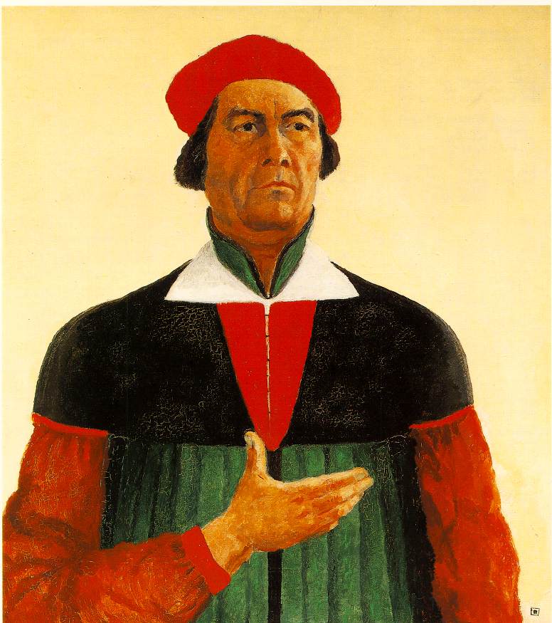
Finally, a word about the ghost of Kasimir Malevich floating in the trio of images that bracket this post. Ages abound between our time and the hundred years ago when Suprematism was first conceived. Ages abound between the three of us in the Hionas show: Gary at 74 years old, myself at 60 (the number still amazes me!), and Rafael at 38. Kasimir's image abounds too: the Black Square, Malevich's later return to his folk inspired roots (representational and stained with the aura of suprematism) and finally his Black Cross.
The thing is, Malevich had this strange habit of scrambling the dates of his paintings. Art historians tend to overlook this... bizarre, I know. When they don't ignore it, they mumble something about Stalin. But if the gulag loomed, wouldn't Kasimir paint in the socialist realist style that would spare him the Siberian adventure? Malevich's late paintings of peasant figures were relentlessly colored and inflected with abstraction. His famous and apparently sober self portrait, colored in absolute terms, was signed with a miniature Black Square. This is not the act of an artist in hiding. Regarding his legend, I think that there is a kind of hagiography of abstract legend to protect, the linear story (Mondrian's Tree) that starts with representation and ends with "pure" abstraction. The scholarship is spotty on Malevich in general, and I doubt that we will ever know the real truth of him. I nurse the idea that the great Russian recognized the continuity between the alpha and omega of representation and abstraction, that one implies the other.
Life is that which is strung between, isn't it?
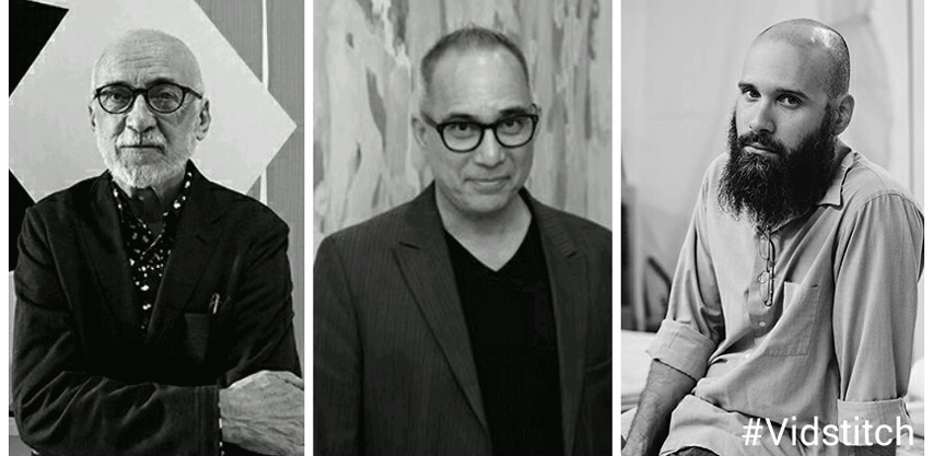
Left to right: Gary Stephan, Dennis Hollingsworth, Rafael Vega
Gary Stephan Interview with Gorky's Granddaughter
Gary Stephan Interview with Bad at Sports
Barry Schwabsky on Rafael Vega
Phaidon (Vitamin P3) featuring Rafael Vega
Posted by Dennis at December 21, 2016 10:19 PM
Congrats hope I can catch it. Big Stephan fan. Thanks for all you do. Great blog.
There is a lecture Gary gives on Vimeo at SVA in which he begins by comparing I think Napoleon by Ingres with a naval battle by Manet, calling it the beginning of modernism because the visual contract with the viewer is reconfigured, because so much is demanded from the viewer.
Much appreciated, vc. Hope to meet you at the opening! And thanks for the hot tip (Gary's SVA Vimeo), I really like his thoughts about art history.